Advanced image manipulation in the browser is still something of a difficult topic. There are quite a few libraries and web editors available, but working on “bare metal” just based on web standards is not that easy—you have to use canvas and working with it directly is a bit of a pain. However, SVG and CSS (and especially their interaction) made great strides in recent years. That means that if you don’t really have to edit the image - just preview it - you might not even have to reach for canvas.
Recently I found myself having to reconstruct images decomposed into channels. I looked at images taken with a confocal microscope which come decomposed into individual channels (not necessarily RGB, it depends on various factors based on what the microscope was observing) that the viewer wants to later put together and manipulate. Initially I wanted to use a full-blown web image editor for that, but it turns out that CSS already has quite a few primitives that let you solve this kind of problem, notably the mix-blend-mode property to put the channels together and the filter property combined with custom SVG filters to colour them.
Microscope images that I worked with come in the .czi image format and are designed to be viewed in the Zeiss ZEN system. However, you can export grayscale images for each channel and manipulate them in the browser. Since I don’t have a real microscope image that I can share, instead I’m going to decompose this picture of a parrot from Unsplash.
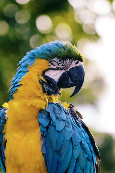
Image blending
The first trick that you can use is the css mix-blend-mode property which applies image blending to overlapping elements. Specifically, you can use the Screen blend mode and absolute positioning to mix the individual channel images together. You also want to use the isolation property on the parent so that the blending is only localised to the images.
<div class="row">
	<img src="red.jpg" class="channel red" />
	<img src="green.jpg" class="channel green" />
	<img src="blue.jpg" class="channel blue" />
</div>
.container {
	height: 4rem;
	width: 4rem;
	position: relative;
	isolation: isolate;
}

.channel {
	position: absolute;
	mix-blend-mode: screen;
}
SVG Filters
Now you can create some SVG filters to colorise the image. There is no built-in CSS filter that can colorise a grayscale photo, but CSS can use custom SVG filters. There are a few ways you can create a SVG filter, but to colorise an image you can use the <feColorMatrix> filter type, which uses matrix multiplication to colorise each individual pixel of an image.
You can define a SVG filter like this:
<svg class="filter">
	<defs>
		<filter id="myFilter" color-interpolation-filters="sRGB">
			<!-- filter goes here -->
		</filter>
	</defs>
</svg>
Now the filter is ready to use by applying the CSS property filter: url(#myFilter);.
Note that this definition will still render a SVG image that’s going to potentially clutter up your page. Applying display: none; on it might be the first instinct, however that will only work in Chrome—in Firefox the filters will not be visible. Instead you can hide it by applying some CSS styles:
svg.filter {
	position: fixed;
	left: 0;
	top: 0;
	height: 0;
	width: 0;
}
This should work fine in all browsers.
Color matrix
The color matrix filter uses the SVG <feColorMatrix type="matrix"> filter. You provide the matrix in the values parameter. The identity filter (i.e. one that doesn’t do anything) looks like this:
<feColorMatrix type="matrix" values="
	1 0 0 0 0
	0 1 0 0 0
	0 0 1 0 0
	0 0 0 1 0
"/>
Color matrix uses matrix multiplication to change the colours of each rendered pixel.
The individual colour values are computed like so:
The last row of the matrix is all constant so it is ignored (it is also not provided to the <feColorMatrix>).
The matrix provided in the above example is an identity matrix, e.g. it will result in the same image being rendered after applying the filter. You can verify that yourself by plugging it into the equations above.
While working with grayscale images, the R, G and B values are always equal so you can colourise the image by changing the , and values in the matrix for each channel. You can also ignore the alpha since there is no transparency. As such, the resulting parametrised matrix looks like this:
<feColorMatrix type="matrix" values="
	r 0 0 0 0
	0 g 0 0 0
	0 0 b 0 0
	0 0 0 1 0
" />
Where r, g and b are individual color values you choose to apply to the filter.
Let’s create filters that we’ll use to recompose our parrot.
<svg class="filter">
	<defs>
		<filter id="red" color-interpolation-filters="sRGB">
			<feColorMatrix type="matrix" values="
				1 0 0 0 0
				0 0 0 0 0
				0 0 0 0 0
				0 0 0 1 0
			" />
		</filter>

		<filter id="green" color-interpolation-filters="sRGB">
			<feColorMatrix type="matrix" values="
				0 0 0 0 0
				0 1 0 0 0
				0 0 0 0 0
				0 0 0 1 0
			" />
		</filter>

		<filter id="blue" color-interpolation-filters="sRGB">
			<feColorMatrix type="matrix" values="
				0 0 0 0 0
				0 0 0 0 0
				0 0 1 0 0
				0 0 0 1 0
			" />
		</filter>
	</defs>
</svg>
.red {
	filter: url(#red);
}

.green {
	filter: url(#green);
}

.blue {
	filter: url(#blue);
}
Here for demonstration purposes I’m only colouring the image with static values but the colour matrix can be manipulated interactively using React, for example.
Level filters
If you’ve used Photoshop or GIMP you might be familiar with the Levels tool, which allows the user to change the spectrum of colours that the edited image displays. This is most commonly used to correct exposure in photographs. Indeed this is also what I wanted to replicate in the confocal microscope example, since the images taken by the microscope were notoriously underexposed.
The levels tool has three sliders: the black low-pass filter that removes the darkest tones from the image, the white high-pass filter that removes the lightest tones, as well as the gray midtone slider which applies gamma correction. You can do similar things using the <feComponentTransfer> filter.
Gamma filter
Gamma correction is relatively easiest of the levels sliders. It happens inside a <feComponentTransfer>.
The identity filter looks like this:
<feComponentTransfer>
  <feFuncR type="gamma" exponent="1" />
  <feFuncG type="gamma" exponent="1" />
  <feFuncB type="gamma" exponent="1" />
</feComponentTransfer>
You can adjust the gamma by changing the exponent attribute. We can change the exponent for each channel individually.
Low- and high-pass
You can implement high pass and low pass by misusing the table type of <feComponentTransfer>.
I find calling it a “table” type somewhat misleading, I think it’s more instructive to think about it in terms of a curve or perhaps a graph, because that’s what it more accurately represents.
We can create an identity filter like this:
<feComponentTransfer>
  <feFuncR type="table" tableValues="0 1" />
  <feFuncG type="table" tableValues="0 1" />
  <feFuncB type="table" tableValues="0 1" />
</feComponentTransfer>
What is most important here is the tableValues attribute. This denotes a linear curve of colours from 0 to 1, like on the Curves tool in a digital graphics program.
You can add additional values to the tableValues attribute. For example, if you set it to 0 0.25 0.5 0.75 1, it will still be an identity filter. There is no theoretical limit to the length of the tableValues attribute, but in practice it wouldn’t make sense to include more than 256 values to represent each possible channel value.
However, if you go back to the value 0 1 and change it to e.g. 0.1 0.9, this will bump the points of the curve vertically, effectively reducing contrast. If what you want is to move the points of the curve horizontally (which is what manipulating the input levels in the Levels tool does), you can do it by adding more points along the graph at 0 and 1, for example: 0 0 0.5 1 1. This will increase the contrast. You can add points proportionally this way, but unfortunately, there is no practical way to add points at specific contrast or luminosity values using CSS filters, but we can abuse the fact that there is no limit to how many tableValues we can add.
You can use a d3 linear scale and a method to obtain exact ticks of a scale. Take 256 exact ticks of a scale 0-1 and join them to create the tableValues.
const tableScale = d3.scaleLinear([0, 1])
const tableValues = exactTicks(tableScale, 256).join(' ')
To create a filter that precisely increases contrast, you can take the values of the low and high pass sliders that you want to apply, generate an array of 0s or 1s respectively with the length of the slider value and append or prepend it to the ticks generated by the d3 scale. You also want to decrease the number of ticks generated.
const lowPass = 10
const highPass = 200

const tableValues = [
  ...Array(lowPass).fill(0),
  ...exactTicks(tableScale, 256 - lowPass - highPass),
  ...Array(highPass).fill(1),
]
Conclusion
The ability to use SVG filters in CSS is really powerful and I’m glad to have discovered it, because there are quite a few applications where it comes in handy. I hope you found it instructive as well.

